
How Colors and Typography Impact Web Design
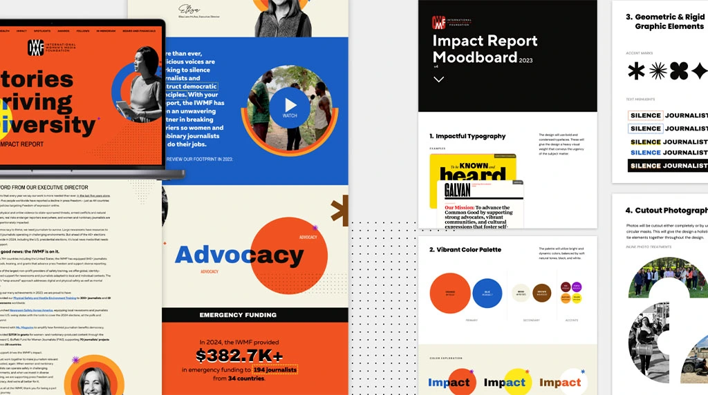
When it comes to web design, your visuals are important, and matter far more than you think. The correct blend of colors, along with typography, help you to have a website that looks fun and professional or one that makes visitors confused and uninterested. These design features can have a significant impact on user experience (UX), brand identity, and even conversion rates. Let’s see how these two aspects of design affect web design in 8 ways.
First Impressions Matter
Color and typography are the things visitors look at first when they come to your site. A cohesive color palette with clean typography makes a warm environment. Conversely, bad color combinations and fonts that are impossible to read make users flee for the hills in seconds. As most users make up their mind within a few seconds of judging whether to remain on a site, these items have a direct influence on user retention.
Establishing Brand Identity
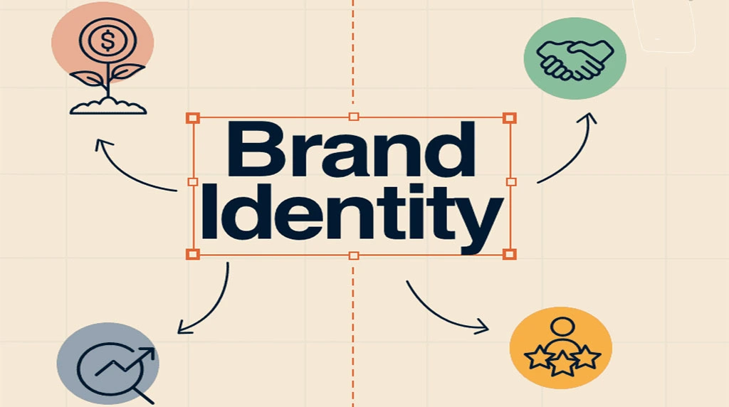
All brands have a story to tell and the design elements of its tell that story. Colors have feelings—blue is associated with trust, red is related to excitement and green is linked with growth. Typeface also has personality; as an example, “modern” sans serif fonts are clean lines while “traditional” serif fonts have a more erasable look.” When weighted properly, color and type work together to solidify your brand and show consistency across all your digital roadways.
Guiding User Attention
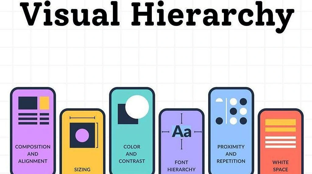
A balanced color scheme in your design emphasizes key elements, like calls-to-action (CTAs), navigation menus, and headlines. Bright, contrasting colors attract attention, and they direct the user’s attention so they can find what they need quickly. Typography partakes in this as it builds hierarchy — varying font sizes, weights, and styles lead the users through the content in a logical manner and makes the content more readable.
Improving Readability and Accessibility

Legibility Strive for effective communication. Frustrating for users are fonts that are too ornamented or colors with insufficient contrast. Dark text on a light background is generally the most legible, but high-contrast combinations are better for users who are visually impaired. Typography size, spacing, and line length are also factors that web designers should consider to maximize reading comfort, and in turn, accessibility.
Evoking Emotions and Mood
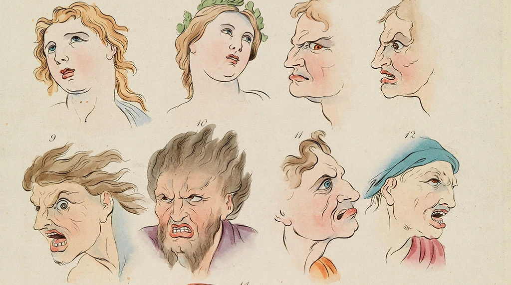
Colors make users feel certain ways. Warm colors (red, orange, yellow) are known for being energetic and exciting and cool colors (blue, green, purple) are known for bringing a sense of calm and trustworthy feelings. Typography can influence feeling too – potentially more so with regards to the nature of the font (a playful and informal looking handwriting font feels friendly while a sharp, clean and minimalistic font feels more like work) but also in other ways. They work in unison to create the mood of the site and define a user’s emotional perception of the brand.
Enhancing User Experience (UX)

A good balanced design not only looks great – it also enhances usability. Considered color selection avoids straining the eyes and uniform typography makes the reading experience easier. When users perceive the design as attractive and easy to use, they are more likely to stay longer, visit more pages and convert, whether subscribing, buying or contacting.
Boosting Conversion Rates

Colors and typography can directly affect conversion rates. For example, a bright, attention-grabbing button color paired with bold, readable text encourages more clicks. Similarly, clear typography in product descriptions and headlines builds trust, making users more likely to engage. Strategic use of design elements not only attracts attention but also nudges visitors toward desired actions.
Creating Consistency Across Platforms

Color and typography consistency fosters brand trust. Your users should experience the same thing no matter if they use your website, mobile app, or social media profile. A uniform palette and font choice will help solidify brand recall and lend credence and professionalism to your business. When the brand is inconstant, it can feel chaotic and untrustworthy to the visitor.
Final Thoughts
Colors and typography are more than just design details — they’re potent instruments that impact how a user feels, what they do, and how they perceive a brand. With the right color palette and font choice, web designers can produce sites that are not only attractive and easy to use, but also leave a positive impression. When used strategically, these design elements can help increase engagement, enhance accessibility, and drive conversions.
FAQs: How Colors and Typography Impact Web Design
Colors create the first impression of a website and influence users’ emotions, trust, and actions. The right color palette improves readability, highlights important content, strengthens brand identity, and encourages visitors to engage. Consistent color choices also make a website look more professional and visually appealing.
Typography makes website content easier to read and understand. Choosing clear fonts, proper sizes, spacing, and hierarchy helps users scan information quickly. Good typography also reflects your brand’s personality, enhances accessibility, and keeps visitors engaged, leading to a better browsing experience.
Colors and typography complement each other by creating visual balance and guiding users’ attention. High-contrast text improves readability, while attractive color combinations emphasize headings, buttons, and important information. Together, they build a consistent design that enhances user experience and encourages visitors to explore the website.
Use a limited color palette that matches your brand and select easy-to-read fonts. Maintain strong contrast between text and background, keep font styles consistent, and use headings to organize content. Testing your design on different devices ensures it remains attractive, readable, and accessible for all users.
Yes, effective colors and typography can significantly improve conversions. Clear fonts make information easier to understand, while strategic colors attract attention to call-to-action buttons and key messages. A visually appealing, readable design builds trust, reduces confusion, and motivates visitors to take actions such as signing up or purchasing.